A Logo tells the world who you are, what you do and hints on your brand’s values. So with a logo, you don’t need to spend so much time explaining how great your brand is, an effective logo does it for you perfectly.
As you may already know; a great logo makes a great first impression. It symbolizes professionalism and trust. It communicates with the subconscious minds of your potential customers and thus influences their buying decisions. These highlight some of the many benefits of a cool logo design. You get the benefits when you get your logo right.
Here, you will learn about the characteristics of a great logo. We are here to give an overview of the basic logo qualities. These qualities would increase your brand’s value and make people expectantly look forward to having a thing to do with your business.
So what makes a good logo?
If you are looking to have a good quality logo that satisfies the needs of branding, you need to consider the criteria we have analyzed for you below.
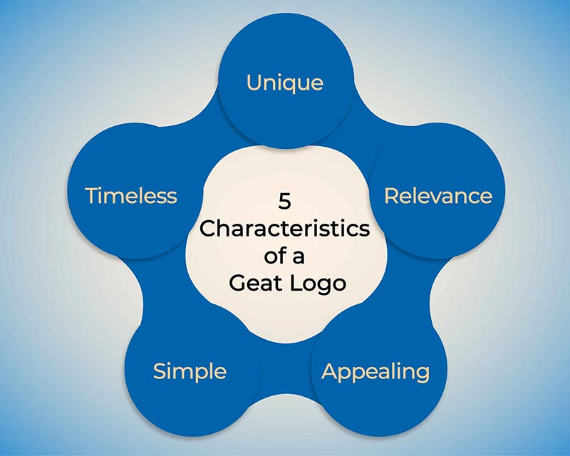
5 characteristics of a good logo:

Unique
A unique logo sets your brand apart. Ensure your logo does not make you look like the competition. You may have an ocean of competitors but no one does the business quite like you. And that’s the message a unique logo communicates to your audience.
With a non distinct logo, your potential clients and customers may confuse you with another brand. As a result, your confused potential customers may go with your competitor rather than you.
When you finally get your logo right and it’s looking unique, you will do well to register the logo legally. With trademark registration in place, you will enjoy legal protection against infringement. Your competitors are then prevented from using your trademarked logo or brand name.
Relevance
Beyond just being a unique and cool logo design, a great logo stands for something. This means your logo should send a clear message to your audience about the service or the value your brand offers.
You can speak about your values to your intended audience using colors, shapes, typography, tone and so on.
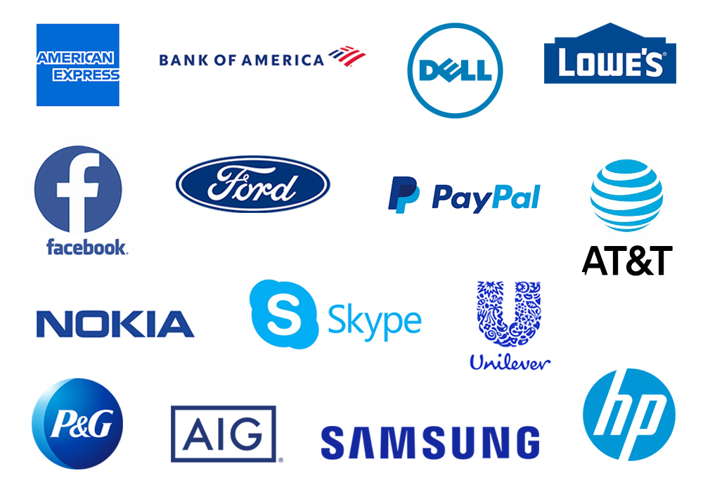
- Blue color, for example, conveys Trust, Professionalism and Reliability. That’s one reason many financial institutions (including Prudential, Merrill Lynch, Liberty Mutual, Barclay’s, Aflac, Bank of America, Deutsche Bank, and Wachovia) use blue in their logos. The banks need to instantly create the sensation of trust and security in their clients, and the use of color blue helps in that regard.
Red, in another vein, evokes feelings of passion, alertness and strength.
White is used to convey purity, cleanliness, efficiency, simplicity and luxury in logo designs.
Black suggests power, success, affluence, authority and strength while a warm color like yellow makes your brand appear friendly, positive and energetic.
- When it comes to shapes, a triangular logo can help your brand display authority and leadership characteristics. Circular shapes on the other hand represent friendliness.
Cool brand logos tick the “relevant” box. It is advised to do a little research on your audience to ascertain what design elements will best appeal to your target audience.

Appealing
Does your logo look attractive to you? What do your associates think about the logo? You can also get the opinions of your friends and family regarding this.
Professional logo designs are appealing so your logo should look appealing to your target market.
Marketers understand that getting people to buy starts with getting people to “look” (attention). There are many ways to win a prospect’s attention, and having a logo that looks appealing to the eye is one sure way.
Simple
Can someone describe your logo by simply looking at it? Simple logos are easily recognizable. And this makes simple, cool company logos very well memorable. Endeavor to use few shapes, colors and just a simple scheme.
A complicated logo will not establish an instant and meaningful connection with your audience. This is because the human mind is wired to crave simplicity.
If your logo design is effective, it will reflect your overall brand values in one simple manner.
You may want to do away with things like drop shadows, gradient fills and just about any complex features. You should use such attributes only when they are absolutely necessary.
Timeless
Your logo is your identity – it is not to be changed aimlessly. Trust is at serious risk when identity changes every now and then. Only slight, infrequent modifications are advised on logos. Your logo should be designed to remain relevant and effective for years to come.
Just like the Coca Cola logo (a perfect example of an evergreen logo), a good logo is designed to be timeless. Though, the Coca Cola logo has been redesigned a number of times to keep up with modern needs, the identity remains strong throughout the iterations.
Do you want a timeless logo? Then don’t be overly trendy. Rather, focus on quality. Take a cue from the logos you know that have withstood decades of changes in their respective industries (like the McDonald’s logo).
Another aspect of timeless logos to note is; they use little to no gradients. They keep colors simple.
Do you think your logo will be relevant in 5 years? What about in 10 years?
Will it still be relevant in 50 years?
Investing in a Great Logo is Worthwhile
As you already know, first impression matters.
Having a professional logo can make prospects trust you and your products / services. To have a well designed logo, you may need to buy a professional logo design service offered by a professional logo designer.
If your logo is well designed, you will attract potential customers. You will especially attract people who love quality products or services. And who doesn’t love quality products/services?
Traditionally, your industry, the value you offer, and how you want to be perceived should dictate the predominant color of your logo. But you can as well consider having colors that trigger buying emotions in your logo as an add-on.
Warm colors like Orange, Yellow and Red encourage people to buy. You can take advantage of the warm colors by intertwining them into your logo design.
This is worth repeating; you get the benefits (of having a great logo) when you get your logo right.


0 Comments